A Short Rant About Book Design
I'm as much of a sucker for Penguin's history of paperback designs as the next man, but, like a lot of others, I find their habit of redesigning their books seemingly every other week rather annoying. This is not least because most of their recent redesigns have been completely out of keeping with the best qualities of their design history - about the only one that has pleased me was the series with covers by prominent comics artists. It occurred to me this morning that there are 4 series, which I tend to buy when I come across them (to say I collect them would imply a dedication I don't have), to whose properties Penguin should just stick forever:
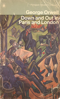
1) the Penguin Modern Classics series with concrete-grey spines and back-covers, white lettering and geometric arrangement of central images that resist such rationalising tactics (cf. this)
2) the classic blue-cover Pelicans, that formed the basis for pretty much the entire aesthetic of Ghost Box (the only one of these I have is my copy of Marcuse's Soviet Marxism) (cf. these)
3) the Penguin Science Fiction series, already noted by pretty much every blogger ever, but particularly the 60s covers, from when Brian Aldiss was editing the series, with surrealist deathscapes enclosed by Marber grids
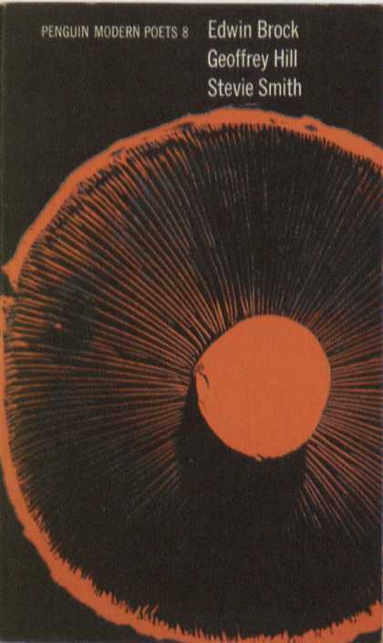
4) the first incarnation of Penguin Modern Poets, which I still regularly come across in charity shops, my personal favourite volume being the Ashbery/Harwood/Raworth (sadly not on Google Images, though this is).
Everything else can fuck off, frankly.
While we're on the subject of design, am I the only one who thinks the Faber Poetry Firsts series is pretty pointless? Firstly, if you're going to reissue old single volumes, why not just revert to the old Faber design template, which was superior to the duo-chrome ugliness of their recent publications? Secondly, if you're going to bestow nice new hardcovers, give them to books that are exciting - no-one needs another edition of Larkin's Whitsun Weddings in this world, nor of Ariel, no matter how wonderful it is; if it wasn't for the presence of Alice Oswald's Dart (about the best poetry collection Faber have published in the last 10 years) you'd have thought they hadn't released a decent book in decades. The whole enterprise, arriving at a time when Faber are publishing about 2 new poetry collections a year, smacks of the most blatant laurel-resting.
posted by Dan at 2:33 AM
![]()


8 Comments:
I like the black Penguin Classics. The only non-contemporary author I own is Thomas Hardy, all in black covers. I quite like the duo-tone Faber covers actually, especially the green ones they've got for Edward Thomas and Philip Larkin's Collected Poems. The old design template actually really annoys me.
I quite like the black PCs too.
Interesting to see how the design for Ballard's work has changed. The recent Harper Perennials that I have of some of his work tend to go for a fairly generic, high-contrast urbanism. I rather prefer the 60s Penguin versions you link to...
The Pelicans are indeed sublime... just got hold of a second-hand copy of Raymond Williams' "Culture and Society" which is in this mould.
Ian: I'm fond of the Penguin Classics design, but prefer the old version of that template - basically the same as the old Modern Classics, except all black, white lettering and minimal lines. My copy of Pascal's 'Pensees' is in that edition. And what is that annoys you about the old Faber template?
Tom: I just remembered this morning, as I was packing, that I've got a copy of that Pelican 'Culture & Society' (it's a misprint, though, repeating some pages), as well as 'The Long Revolution'. Love the slumped author photo on the back, too. I rather like the fact that some of my Pelicans come with the Open University logo on the side, too - democratic education for the win!
Agree with the above that the recently retired Penguin Classics were, well, a classic. There was something elegant and economic about the austere black & bone plus bright tab whose colour indicated the book's origins: red = English, purple Latin/Greek, yellow French/Spanish etc
The redesign mixes serif & sans serif in quite a clunky way, while simplifying the palette to just black & orange = both boring because it reduces the variety and predictable (ah! Penguin Orange!)
Interestingly both the Faber Poets designs you mention were done by Pentagram. The older one I think is fussy and old-maidish. The Scotch rules, the wallpaper effect of the tesselated double-f ligature...
The new one I really admire because the designer Justus Koehler has come up with very simple rules which work for the whole series. 1 Left aligned. 2 Take your longest line and make it the full width of the type area. 3 Whatever point size that is = the size for the author and title. 4 That point size determines the leading and where the type begins. 5 Just three colours: background, author, title (and they generally harmonize in interesting ways). Plus the matte textured uncoated card, the endflaps.... NICE
I might write a post about this, because what all these series designs struggle with is the tension between having a uniform appearance, ie - sigh - a visual brand which implies quality by association... and the trade-off in which constant repackaging can drive sales. Penguin (yawn) seem to be frantically pursuing both strategies at once: endlessly promoting their own iconicity, while endlessly repackaging their list and the classics with diminishing returns (ie that lame Voyages series, the Love one, the Draw Your Own! gimmick covers etc)
ps
Persephone Books has an interesting house style - check it out http://www.persephonebooks.co.uk/pages/content/index.asp?PageID=57
And also an intriguing reprint mission. I wonder if Anwyn C is aware of them?
I think the new Faber template works in quite a lot of cases, for exactly the reasons you mention - the Larkin & Thomas ones Ian mentions above are good cases, as are (to cite more recent examples) Heaney's 'Electric Light' & Emma Jones' 'The Striped World'. But then there are ones where you wonder whether this 3-colour hasn't pushed them, through exhaustion of combinations, into palettes beyond the limits of polite convention, cf. the first version of Heaney's redesigned 'New Selected Poems', or the Muldoon one mentioned above. I'd also appreciate it more if they actually did stick to it - I've noticed some recent publications (Heaney's 'District & Circle', Paterson's softback of 'Rain', the repackaging of Eliot's selected poems as 'Let Us Go Then You & I') that have abandoned it.
I've seen Persephone books about, mostly in charity shops (not suggesting anything, just that that's where I do most of my book-shopping) - always liked the design, but never been intrigued enough by the contents to buy them.
A couple of other things: probably my favourite poetry imprint for design is Carcanet, for the things they achieve within a relatively rigid design template, that reminds me of what I like about early Penguins, and for the page layout, which I prefer to Faber for the slightly less bulging font. I also rather like the look of the new Radical Thinkers series from Verso: stark white background, uniform font-size, black and cyan lettering, geometric abstract black traceries. Some good titles coming up too: Jameson's 'Brecht & Method', Peter Osborne's 'The Politics of Time', Debord's 'Commentaries on the Society of the Spectacle'...
I have to say I LOVE the Muldoon - where was it mentioned above?- if we're talking about that shocking acid-yellow-green one. I'm a big fan of the lovely coloured covers anyway, with their bold yet simply typographical look, so well described by Mr or Ms Travelcard.
Re the Faber Firsts, maybe the whole idea is that they HAVE to rely on the hoary old standards, as they publish so little new poetry... I thought The Striped World was boring.
Post a Comment
<< Home